Magazine cover 1 - Gore Magazine

This Magazine cover Has:
- A Horror Title - It's in a big, jagged, loud font, to match the genre.
- A red/orange background - The red represents blood, and creates a creepy mood.
- A main image that takes up the front page. - The image is an uncomfortable one, of a lady licking blood of her hands.
- Magazine Content - So you know what's in the magazine. The text is in a font different to the logo, but it still fits in with the horror genre.
- A colour scheme - The coloruscheme is orange, white, and red. They are not the most brightest mix of colours, so they fit in with the genre.
- The Words Are All In Capitals - To make it stand out
- A Big Story Advertised - To pull you in.
- A Barcode.
Magazine Cover 2 - Ruedmorgue

This Magazine Cover Has:
- A Large Title, Which Is Hard To Understand As People Won't Know What It Is - It is in a large, bold font with a red outline to give it a creepy effect.
- A Black Background - For a mysterious effect.
- A Main Image Of A Small Boy, Who Has The Shadow Of A Cross - It doesn't take up quite all of the room, but it's the only image on the front cover, aand red is the main colour.
- A Magazine Slogan - To go with the magazine to make it more catchy.
- Magazine Content - To draw you in to read the magazine so you know what's in it.
- A Colour Scheme - The colour scheme is red, white, and black. They are all dark colours, so they create a dark mood.
- The words Are All In Capital Letters - To help it standout, so you want to read it.
- A Plus! Section - To keep your atttetnion.
- A Barcode
Magazine Cover 3 - Cryptic Magazine
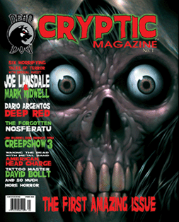
This Magazine Cover Has:
- A Title with A Name That Fits In With The Horror Genre - It is in a bold are red font, in a style that also fits in with the horror genre, there is also a green outline to help make it stand out more.
- A Main Image Which As A Close Up Of A Skeleton - The image takes up the whole of the front page, leaving no room for a background colour.
- A Little Logo In The Corner Of The Page - To show more about the magazine.
- Magazine Content - So you know what's in the magazine, so it pulls you in to make you want to read it.
- A Title Saying 'The First Amazing Issue' - To make it sound great and catchy, so you want to read it.
- A Colour Scheme - The colour scheme is red, green, and white. These colours are quite dark and moody so it helps to make the magazine also seem dark and moody.
- The Words Are All In Capital Letters - To help them stand out, and make it easier to read so you will want to read it.
- A Barcode
Magazine Cover 4 - Fangoria

This magazine Cover Has:
- A Large Title Which Has The Word Fang In, So It Links To Horror - As the title has the word fang in the title look like fangs, to match it. It is in red, and has a white outline, for effect.
- A Main Image Which Takes Up Most Of The Room - The image is of Megan fox, so as she if famous, it will hlep to draw in more people, and fans of hers, to help to sell it. she is a vampire, and her mouth is covered in blood, to make it more scary.
- A Black Background - For a Creepy Effect.
- A Title Which Says - 'Jennifer's Body Megan Fox Will Eat you Alive!.' - It draws you in, as it uses her real name, and because of this it makes it seem more realistic, and pulls you in more.
- Magazine Content - So you know what is in the magazine, before you buy it.
- A Colour Scheme - There is a colour sheme of yellow, red, and white. The red and white, you see in most magazines, but you don't see yellow very often, so it makes it a bit different and helps it to stand out more.
- A Mix Of Fonts - To make it a bit different and more interesting.
- A Mix Of Capital Letters And Normal Letters - Most horror magazines have words in capital letters, so this helps the magazine to look different.
- A Barcode
- A Large Catchy Title - with a red font and an outline of a different colour.
- A Dark Background - As it is more mysterious and creepy.
- A Main Image - It will need to take up most of the room or all of it, and need to be of something uncomfortable.
- A Catchy Maagazine Slogan - To help make the magazine more interesting.
- Capital Letters - To help the magazine stand out, and make it easier to read.
- A Colour Scheme - To help the magazone look good and more professional and less messy.
- Magazine Content - So the readers know what will be in the magazine before they read it.
- A Big Story Advertised - To pull the readers in.
- A Barcode.
So....
From Looking At These Magazine Covers I Have Decided That My Magazine Cover Will Have:
My Magazine Cover Plan:

No comments:
Post a Comment